


Many CBD brands assume that their customers already understand everything they need to know about CBD, THC, cannabinoids and delivery systems. That is a common mistake, and it only increases confusion among new visitors. A first-time CBD buyer may already be uncertain about format, strength and intended use. They might be looking for sleep support, relief after exercise or a general wellness product, but they do not yet know whether a gummy, oil, capsule or topical makes the most sense.
Sometimes, they do not even know exactly what problem they are trying to solve.
When that person reaches the CBDfx or Medterra homepage, the page has only a few seconds to reduce the uncertainty. Instead of asking the buyer to sort through every offer, app, promotion and product path, it should make one sensible place to begin feel obvious. Neither homepage currently does that well enough.
Both companies have valuable evidence, which is essential in a category where trust must be earned. CBDfx has a named Medical Advisory Board spanning several relevant specialties. Medterra can point to credentialed professionals, significant review volume, testing claims and industry certification. Neither company lacks proof or commercial activity. That is a strong starting point.
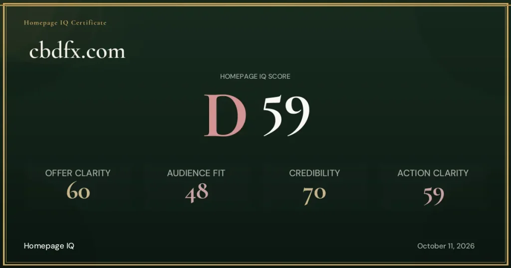
Yet both have below-average Homepage IQ results: Medterra received a C, while CBDfx received a D. This means there are still several important areas they should improve before the holiday season begins.
Our Homepage IQ comparison found that Medterra held the overall advantage and that both brands performed better in Credibility than in Audience Fit and Action Clarity. That pattern matters because a buyer can trust a company and still leave when the page does not organize the decision.
The comparison is therefore about guidance. Which homepage turns a complicated category into a clearer next step, and which asks the visitor to enter several conversations at once? In short, which homepage does the better job of guiding a first-time visitor, in the right order, toward becoming a customer?
CBDfx asks credibility to substitute for positioning
CBDfx gives its Medical Advisory Board unusual prominence. That is a real asset. Four named professionals across fields such as dermatology, pharmacy, veterinary medicine and internal medicine can help the company feel accountable and informed.
The problem is sequence. A new visitor first needs to know what CBDfx stands for, which customer problem it is prepared to solve and why its approach is preferable. An advisory board can validate that argument, but it cannot replace it.
When the opening moves from discount language into expert credentials without a clear brand promise, visitors receive reasons to trust an undefined proposition. They may conclude that CBDfx is legitimate while still lacking a reason to choose it over another legitimate CBD company. Even after reviewing the homepage several times, it remains difficult to identify what makes the brand genuinely distinctive. That is a serious positioning problem.
CBDfx should place one distinctive, customer-facing promise before the proof. The advisory board would then become more persuasive because visitors would understand what those experts are helping validate.
These changes could materially improve the homepage. CBDfx currently receives a D, but clearer positioning and a better-organized first impression could improve that result considerably.

CBDfx’s Homepage IQ assessment makes the underlying problem clear: “The homepage has no hero-level value proposition: a new visitor sees a discount banner, a repeated subscribe-and-save message, and an advisory board section before encountering any brand statement or product promise, which means the page’s strongest asset, its credibility, is doing work that a clear brand message should be doing first.”
This is why adding more proof would not solve the opening. CBDfx already has proof that many brands would value. The page first needs to tell the customer what that authority supports and why it matters to the decision in front of them.
Medterra opens too many doors at once
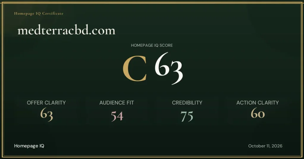
Medterra also has an above-average credibility base. Healthcare professionals, extensive reviews, testing and US Hemp Authority certification can all reduce perceived risk. Like CBDfx, however, it performs less effectively in Audience Fit and Action Clarity.
Its opening can feel like a collection of competing initiatives. A sweepstakes message, an app prompt and multiple calls to action may each have value, but together they create a homepage that behaves like several campaigns sharing the same space. All of this appears before the page establishes a clear understanding of what the brand stands for and whom it is targeting.
That creates a difficult experience for first-time visitors. Returning customers may know what they want. New visitors need the page to set priorities on their behalf.
Medterra’s Homepage IQ assessment describes the cost of the current sequence: “The homepage opens with a sweepstakes banner and app download prompt rather than a brand or product statement, and then presents too many competing calls to action without a primary hierarchy.”

Medterra should decide which single action deserves the most attention from cold traffic. Secondary offers can remain, but they should not compete visually or verbally with the primary path. A homepage is not improved by making every initiative equally visible.
The issue is not that any one of those initiatives is necessarily wrong. The issue is that a first-time buyer must work out which initiative matters before the page has made the brand’s central case. Medterra can keep the sweepstakes, app and quiz while giving one of them a clearly secondary role.
This is a question of customer state, not simply design preference. Someone arriving from a promotion may be ready to shop, while a visitor discovering CBD through search may need help identifying the right format or product for their needs. The homepage can serve both, but it should not give every path the same visual weight.
As it stands, the homepage is not performing as effectively as it could. Without access to Medterra’s analytics, we cannot say exactly how many visitors leave early. We can, however, identify several points where an uncertain first-time visitor could abandon the decision before reaching a relevant product.
Which homepage guides the buyer more effectively?
We have reviewed many CBD brands with stronger homepages. Between these two, however, Medterra holds the stronger overall assessment. CBDfx has a distinctive expert asset, but the page asks authority to compensate for positioning that has not yet been established. Medterra organizes its offer somewhat more effectively, although several initiatives still compete for attention.
The comparison shows why more activity can sometimes produce less direction. A promotion can attract attention. An app can improve retention. An advisory board can establish authority. Each may perform well independently, but the homepage must make them part of one understandable sequence.
Medterra wins the current comparison, but neither company needs another initiative. Both need editorial discipline: one primary message, one sensible first action and proof selected to support that choice. They need to devote more attention to first-time visitors and guide them more effectively.
Changing the hierarchy may come with a short-term cost if certain promotional elements receive less attention. The larger commercial risk, however, is subtler. A crowded homepage can still generate clicks, especially when discounts are strong, while losing visitors who needed guidance rather than urgency. The more useful question is whether first-time visitors reach a relevant product with enough confidence to continue and how many ultimately become customers.
Want to see your brand compared with five named competitors and learn where it could outperform them? The Homepage Intelligence Report identifies where your page creates unnecessary choices and what should be prioritized first.

Strategy tip: Choose the first decision before adding another action
Define what a new visitor should understand before seeing a promotion. The answer should fit in one headline and one supporting sentence.
Decide what that visitor should do next. “Shop now” may work for a category-aware buyer, while a broad CBD range may require guidance by need, experience level or format.
Place one relevant proof point beside the promise. Do not move the entire trust section into the hero. Use the fact that most directly reduces doubt about the first decision.
Reduce the visual authority of secondary initiatives until the visitor has context. Then measure whether first-time visitors move into the intended product or guidance path, not only whether the hero button receives clicks.
You can also use another first-impression optimization tool. Homepage IQ can help identify where the first impression becomes crowded before the company invests in another promotion, app or homepage block. You can also use another first-impression optimization tool.
Method note: This independent comparison reflects the brands’ public homepages as assessed in October 2026. It evaluates homepage communication, not product quality, company performance or customer outcomes.




Have anything to add? Your voice matters! Join the conversation and contribute your insights and ideas below.